Depth you can see through.
Frosted panes floating over blooms of light. What matters comes closer and glows; everything else recedes into the dark.
Glass needs light behind it.
The blur is not decoration — it is proof that something glows underneath. Operate the light yourself.
Drag the light. I drink whatever passes beneath.
Glass is invisible over a void. Give it light to eat — the blur turns whatever glows behind it into the surface itself.
Four layers make a pane.
Blur, a whisper of white, one bright edge, one soft lift. Isolate each layer and watch the others step back.
Four layers. One pane.
Hover a layer below to isolate it.
Born for interfaces.
Dashboards, players, login cards — glass turns hierarchy into physics: the important floats closer.
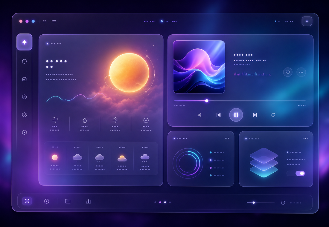
GPU-friendly on modern devices; huge frosted areas are the one real cost.
Type never frosts — ≥4.5:1 body contrast on the pane it actually sits on.
One article gave twenty years of frosted-glass UI a single name.
This is one pane of many worlds.
The same ideas read completely differently in another design language. These are live — step through.
“Depth is honest here — what matters floats closer and glows.”