A Japanese design language
Cute is a
superpower! ♡
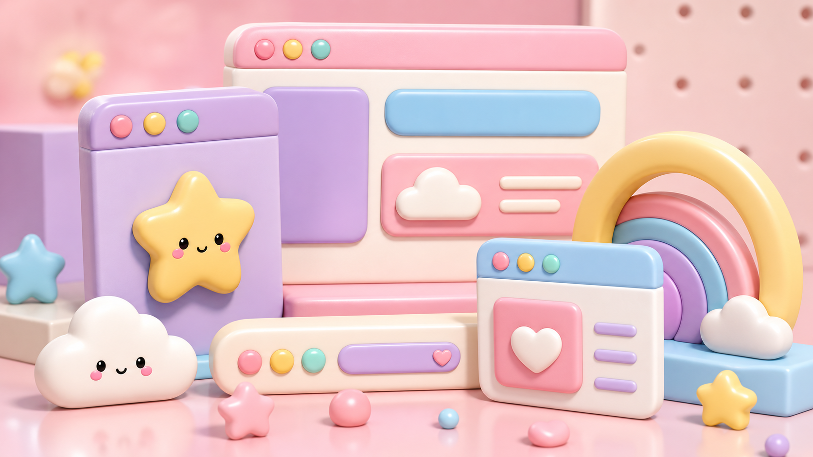
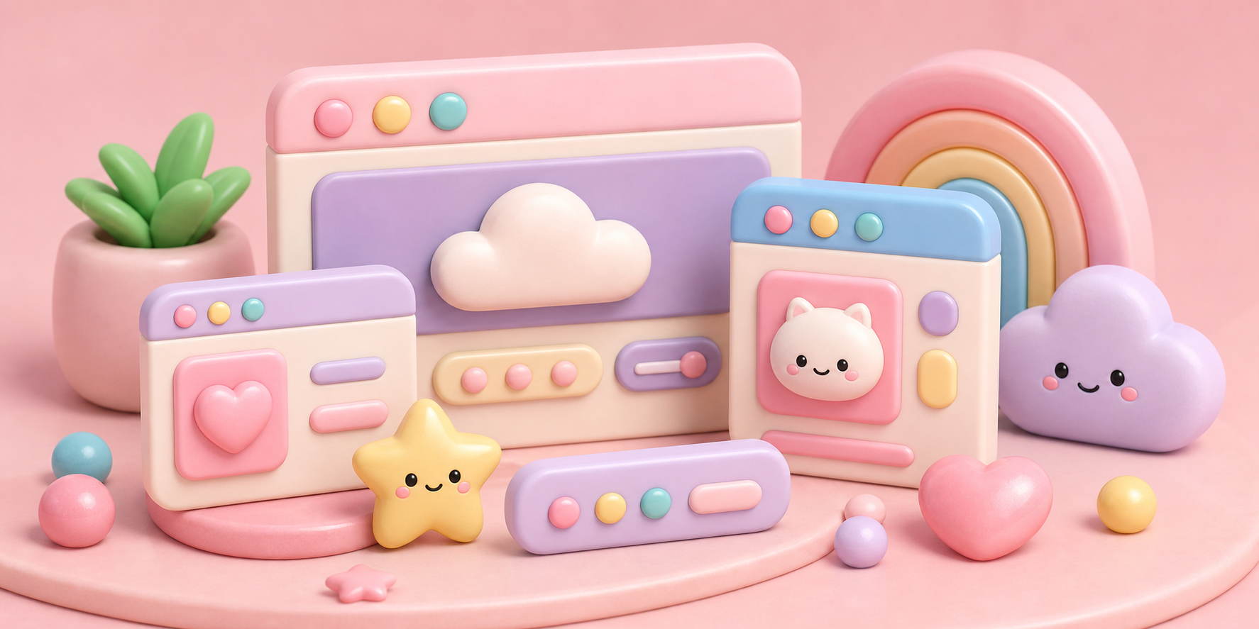
Cute overload. Pastel pinks, rounded everything, and friendly mascots — the Japanese aesthetic of adorableness, built into a whole design language.
View style detail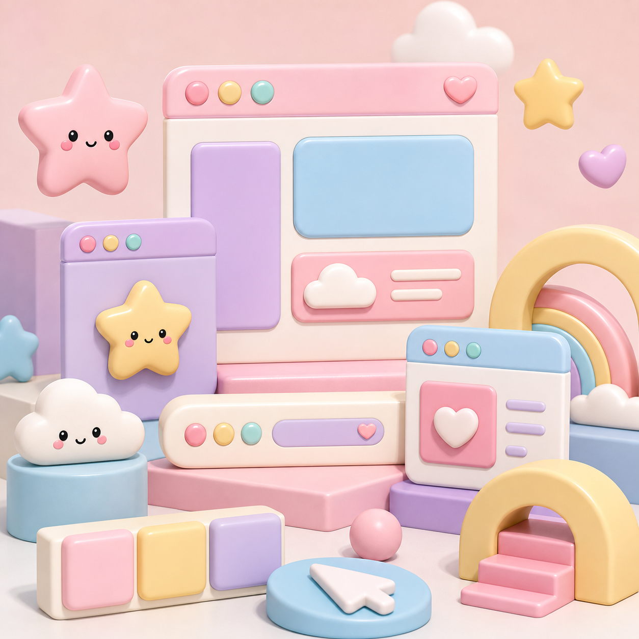
What defines it ♡
Round everything
No sharp corners anywhere. Soft, chubby shapes feel safe, gentle and huggable — the core of cuteness.
Pastel palette
Candy pinks, baby blues and mint greens. Low-saturation sweetness that never feels aggressive.
Mascots & faces
Simple characters with big eyes and tiny features. A face on anything instantly makes it lovable.
Tiny decorations
Hearts, stars, sparkles and bows sprinkled throughout, adding playful charm to every corner.
Where you see it ♡
Kawaii is unique in treating cuteness as real emotional infrastructure, not decoration. Rounded forms and soft color measurably lower a viewer’s guard, making products feel safe, friendly and non-threatening.
Same content, different universe
More cuteness, more universes ♡
Next up — Grunge / Punk ♡
Keep the cuteness going.