Vol. 07 — The Layout Issue
Editorial.
A century of art direction, set for the screen — type, photograph, and a grid worth breaking.
EST. 1928 · AFTER TSCHICHOLD · SET TWICE WEEKLY

The craft
One Break
Per Spread
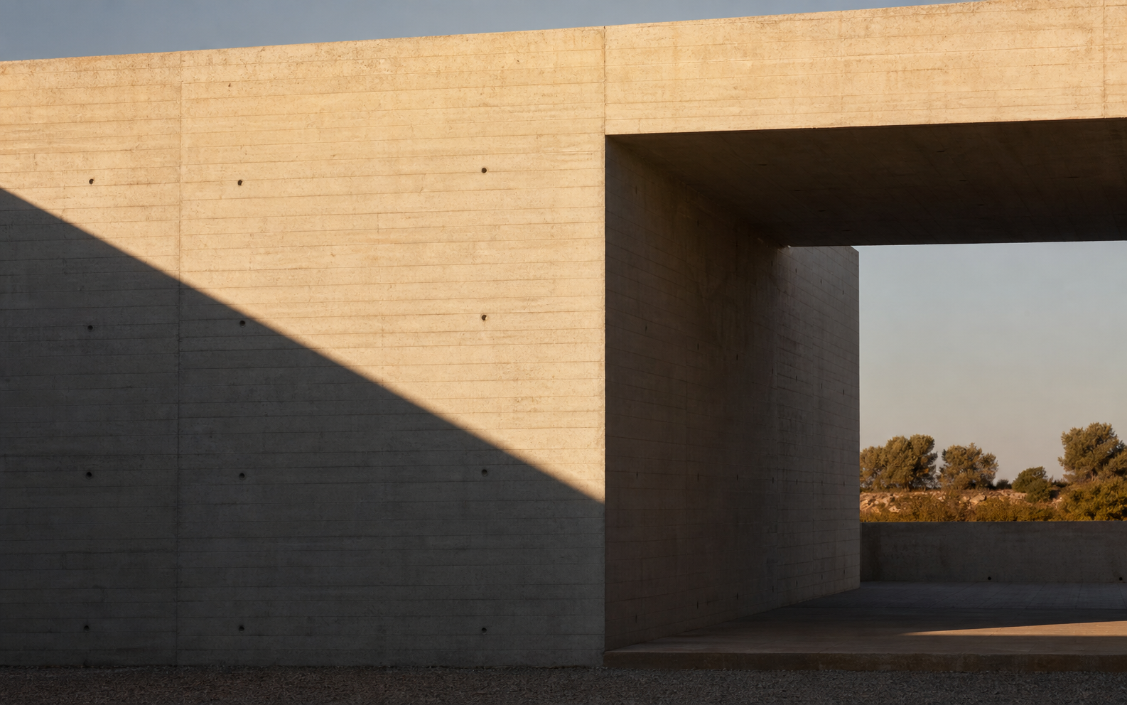
he grid earns its keep by being obeyed — and then, exactly once, disobeyed. An image crosses the gutter. A headline trespasses onto a photograph. One planned violation per spread is what separates an art-directed page from a template.
“Obey completely, then break once — that is the whole art.”
The voices
Type Is the Image
Half of editorial's pictures are made of letters. Hover a specimen — the wall resets in its voice.
The black issue
Why Editors Love B/W
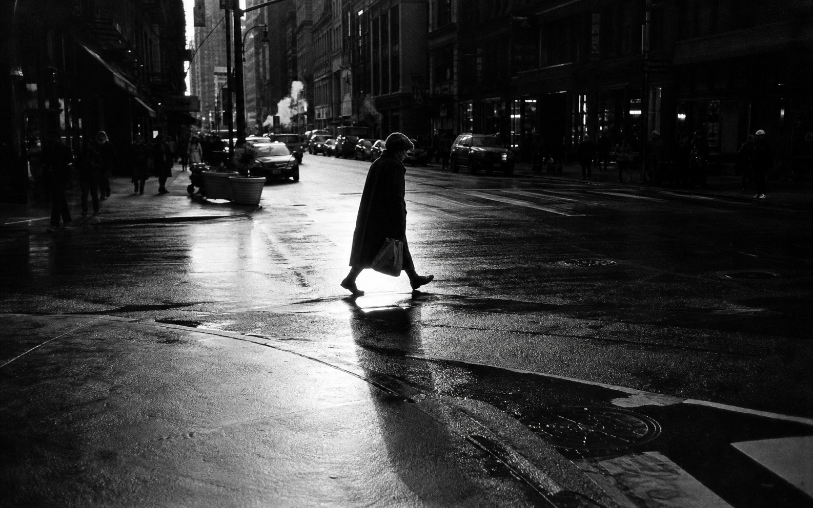
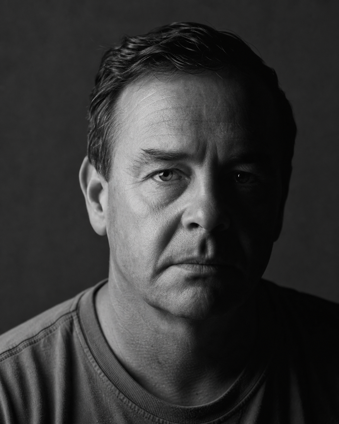
Strip the color and only the decisions remain — light, timing, geometry. Black-and-white is editing made visible.
In other issues
Every Issue Speaks a Different Language
Live pages, not plates — turn to one.
Set in earnest,
broken on purpose.
SET IN PLAYFAIR DISPLAY, FRAUNCES & WORK SANS · TWELVE COLUMNS · ONE BREAK PER SPREAD