Vol. 07 · An issue about issues
Contents
Contents first — that's the manners of print.
Scene 02 · The question
Why Does Edited Feel True?
Same words, same photo. Drag — only the editing changes.
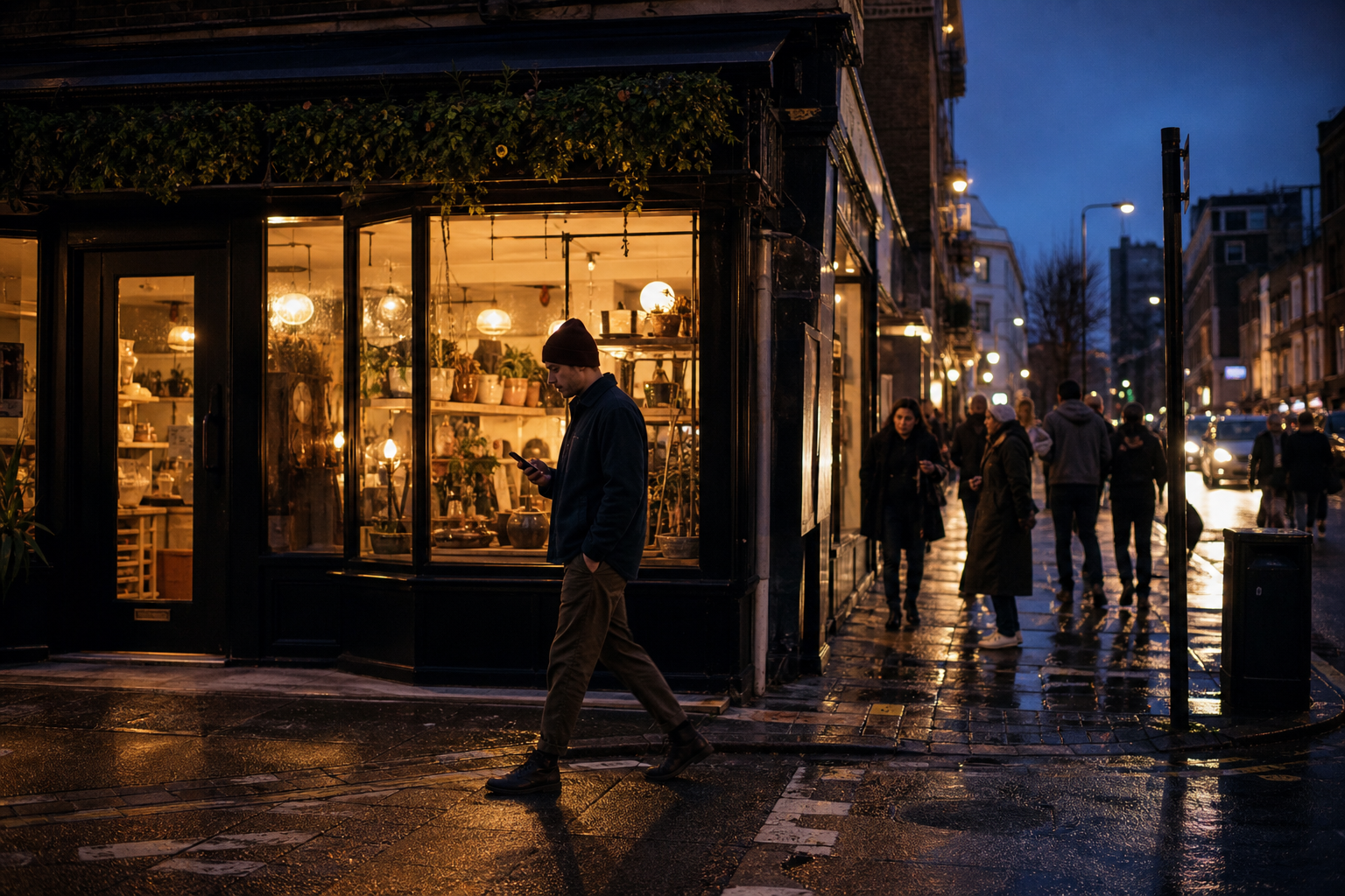
Fig. 01 — dusk, main street. credit: staff photographer
The high street
Evening Falls on the Corner Shop
The same eighty words and one photograph. What changes is only the editing: a measure, a kicker, a caption, a place for everything — and suddenly you believe it.
BY THE DESIGN DESK · PAGE 12
Scene 03 · The shelf
A Century of Art Direction
Six volumes, 1928 to now — pull one off the shelf.
1934
Brodovitch at Bazaar
Alexey Brodovitch invents the cinematic photo spread: image and type choreographed across two pages.
Scene 04 · The contact sheet
The Art Directors
Four names on the contact sheet — the editors of editing. Select a frame.
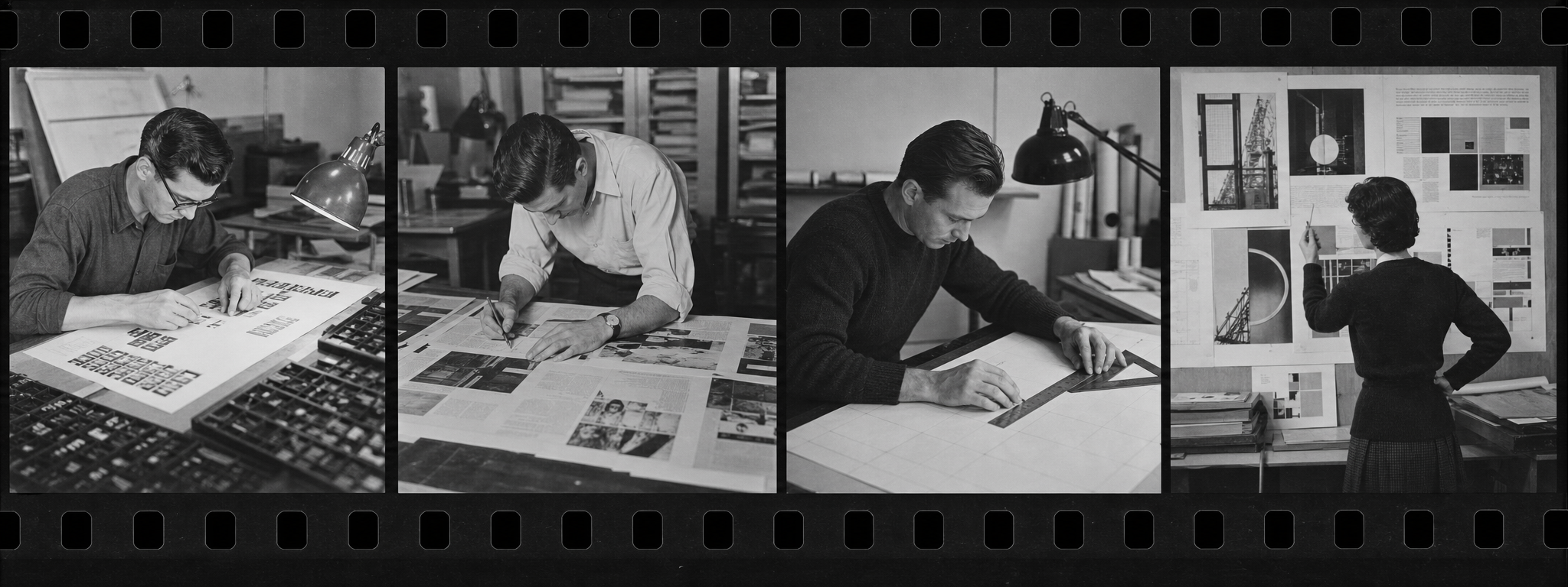
Contact sheet — the editors of editing. Select a frame.
Frame 2 of 4
Alexey Brodovitch
1898–1971
"Astonish me," he told his photographers. His Harper's Bazaar spreads made photography and type move together like film.
Scene 05 · The power-up
The Grid, Revealed
Twelve columns, one crime. Toggle the grid, then choose the crime.
The Measured Page
Fig. — the plate, crossing the gutter.
The measure
Twelve columns discipline every plate and paragraph; then the spread commits its single planned crime, and the page comes alive.
The crime committed: The image crosses the column gutter.
Oversized high-contrast serif — the masthead voice; type at scale is imagery.
Rules, kickers, bylines, drop caps, folios — the trust furniture of the edited page.
A strict grid violated exactly once per spread — the art director's signature move.
Flat cream or white (or one inverted black spread); never texture, never chrome.
Every image is captioned and credited — an uncaptioned image is off-style.
Scene 06 · The shelf
The Reading Shelf
The spreads that taught the screen — one film and the magazines still setting the pace.
Scene 07 · The colophon
Set in earnest,
broken on purpose.
This issue was set in Playfair Display, Fraunces and Work Sans on a twelve-column grid, with exactly one crime per spread.