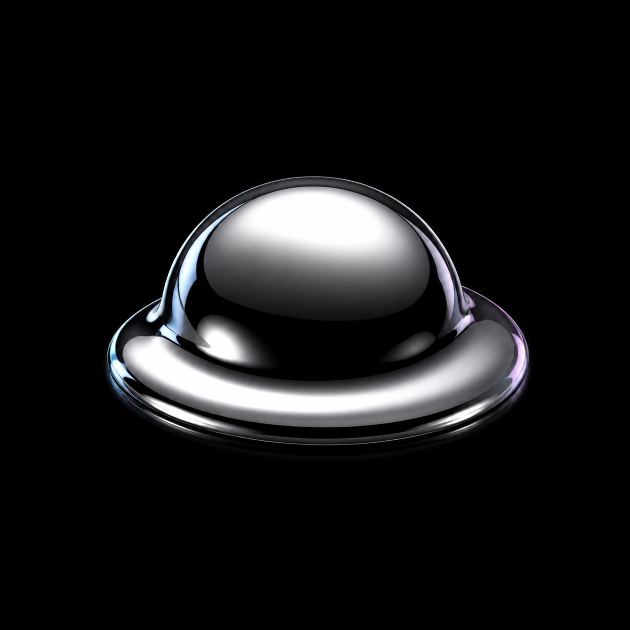
Chrome doesn’t need your color — it borrows the room’s.
Three paste-ready prompts to build Liquid Chrome yourself, plus a distilled DNA summary for AI coding agents.
Build me a complete, responsive business website in the LIQUID CHROME style — the poured-mercury spectacle of DD.NYC's "Liquid Technology", Apple's titanium and Vision Pro product shots, and 2026's holographic/chrome web trend: one liquid-metal mirror surface staged in a near-black void, catching light like real reflective metal, with everything else kept flat and quiet so nothing competes with it. Combine this style seed with my brief below. If I don't give you the details, invent a plausible premium business that suits this next-gen, high-craft look — a spatial-computing startup, a high-end audio brand, a futures-facing fintech, a luxury hardware maker — and build a full, real demo for it, not a placeholder. This style is a FAMILY, not a single template — the same seed should produce visibly different sites for different businesses. A few dimensions are yours to choose: the exact staging of the chrome object, the single UI ACCENT hue, the TYPE pairing, and the overall LAYOUT APPROACH. Pick what fits my brand and COMMIT to it across the whole site. ── INVARIANTS (never break these — they define the style) ── • The stage is a flat, textureless VOID — near-black (~#050507 ground, ~#0A0A0D surface); a near-white void is allowed for lighter brands. No patterns, no photographic backgrounds, no busy texture — a mirror reflects its surroundings, so the surroundings must be almost nothing. A soft radial glow behind the hero object is the only permitted background motion, and it never sits behind paragraphs. • One LIQUID-METAL mirror surface per major section — a morphing chrome blob, mirror-geometry primitive, exploded chrome hardware, or chrome wordmark — staged centered and isolated with one dramatic point-light specular highlight, like a studio product shot. The object may bleed past a section edge to feel like it floats in the void, but it must NEVER cover headline text, body copy, nav, or a CTA. • The chrome material is ACHROMATIC — it carries no assigned hue; it only shows borrowed cool-white specular highlights and, at grazing angles, a faint holographic cyan/magenta sheen. Never recolor the metal itself, or it reads as colored plastic, not liquid metal. • Motion is SMEAR + light-response: elements coalesce out of a formless blur/skew as they enter (weighted, liquid ease-out ~600–900ms, no bounce, no spring); on hover the chrome object tilts toward the cursor and a specular highlight sweeps across it, tracking the cursor near-continuously. Roughly one entrance plus one hover/cursor detail per section — no more. Honor prefers-reduced-motion with a static frame and keep all content visible without JavaScript. • CONTRAST (WCAG 2.2 AA, non-negotiable): every text/background pair is ≥4.5:1 for body, ≥3:1 for large/headline text. On the void, headlines are pure white (#FFFFFF) and body is a cool muted grey that still clears 4.5:1 — never a grey so dim it dips below. On a light void, flip to near-black ink. Never place body copy over the bright part of a glow or a holographic wash without a solid plate behind it. ── VARIABLES (choose what fits my brand, then commit) ── • UI ACCENT — bring my brand's one accent if I give it; otherwise choose a single restrained hue, classically an icy electric blue/cyan (~#4FD1FF). It is used ONLY for links, small UI marks, and the cursor-reactive glow — never on the chrome surface, never as a big filled text panel. Keep it to one accent; the void and the metal carry the drama. • TYPE — one clean geometric display face + one plain body face, via Google Fonts. Display, pick one: Syne · Space Grotesk 700 · Sora · Clash Display. Body, pick one: Inter · Sora · IBM Plex Sans. Headlines are the brightest type on the page; muted subheads sit a clear step below. • LAYOUT APPROACH — choose one and commit: centered single-column hero staging stacked section after section (chrome object centered beneath or behind each headline); a modular dark card/bento grid with thin hairline borders and small holographic icon accents for dashboard-style content; or an alternating left/right stage where the object floats to one side of the type. Settle on your own object placement, glow size, and density. ── MEDIA MODEL (rendered objects, not stock photos) ── This style is carried by rendered mirror objects, not photography. Build the hero and section visuals as chrome/liquid-metal renders appropriate to MY business — abstract morphing metal, mirror primitives, relit chrome versions of my actual product. Where a real product or subject must appear, relight it to match the chrome treatment rather than dropping in an ordinary photo. Use a real placeholder <img> for any planned rendered visual; never fake the metal with a flat colored div. WHAT THIS SITE MUST ACHIEVE (business goal): Make it instantly clear who this business helps and what it offers; position it as premium and next-generation without shouting; reduce a first-time visitor's risk with real proof (results, credentials, client names, guarantees — whatever is true); and drive one clear next step — an enquiry, a demo, a booking, a call. Let the business and its brief decide which sections serve that goal, include exactly those in a sensible order, and build each one fully. BUILD REQUIREMENTS — ship a complete, usable site, not a hero mock: • Real information architecture driven by MY business and goal — whatever sections move a stranger toward acting, each with one clear job, in an order that builds understanding then trust then action. Include working navigation (a thin translucent overlay bar) and a footer. • Don't be lazy with any section: each carries real content depth (never a title plus one thin line), proper internal hierarchy, its own rendered mirror visual, and the full liquid-chrome treatment. If a section only serves the style, cut it; if a section serves the goal but feels thin, flesh it out. • Real, tailored copy for MY business — quiet, confident, premium, short lines that let the surface be the loud thing. Never lorem. • Fully responsive and accessible: semantic landmarks, alt text on every render, and the CONTRAST invariant enforced on EVERY section. On mobile, keep the void, the single-object staging, and the smear motion; scale the object down rather than dropping it. • Apply the void, the chrome staging, the accent, type, and layout approach to EVERY section, not just the hero.
Best for AI website builders — Lovable, v0, Bolt
Restyle my existing site into the LIQUID CHROME look — the poured-mercury spectacle of DD.NYC's "Liquid Technology", Apple's titanium product shots, and 2026's holographic/chrome web trend: one liquid-metal mirror surface staged in a near-black void, with everything else flat and quiet. Keep ALL of my current content, copy, pages, and structure exactly as they are; change only the visual language. Do not invent new pages, remove sections, or rewrite my words. Keep MY brand hue as the single UI accent — carry my existing accent into this scheme rather than swapping in a new one. Push everything else into liquid-chrome's logic: a flat near-black void ground, achromatic chrome for hero visuals, and my accent reserved for links, small marks, and cursor glow only. Then make one TYPE choice and COMMIT — a clean geometric display + plain body that suit my brand. ── INVARIANTS (never break these) ── • The ground becomes a flat, textureless VOID (near-black ~#050507; near-white allowed for light brands). Strip busy backgrounds, patterns, and photographic fills; a soft radial glow behind a hero visual is the only background motion, and never behind paragraphs. • Convert the hero and section-break visuals into ACHROMATIC liquid-metal mirror surfaces — morphing chrome, mirror primitives, relit chrome versions of existing imagery — centered and isolated with one dramatic specular highlight. The object may float past a section edge but must never cover text, nav, or a CTA. Never recolor the metal. • Motion becomes SMEAR + light-response: replace fades/slides with a formless blur/skew that coalesces on entry (weighted liquid ease-out, no bounce), plus a per-section hover where the chrome tilts toward the cursor and a highlight sweeps across it. About one entrance plus one hover per section. Honor prefers-reduced-motion; keep content visible without JavaScript. • Nav and buttons become thin translucent overlays; strip heavy chrome, borders, and rounded skeuomorphic UI in favor of quiet flat controls on the void. • Never: recolored/plastic-looking metal · a gradient or glow behind body copy · busy textured backgrounds · more than one entrance plus one hover per section · a chrome object covering text or controls. ── TYPE (pick one pairing to suit my brand, then commit) ── One clean geometric display (Syne · Space Grotesk 700 · Sora · Clash Display) + one plain body (Inter · Sora · IBM Plex Sans), via Google Fonts. Headlines are the brightest type; muted subheads sit a clear step below. Wrap any existing hero imagery in the chrome treatment (relit against the void) or replace decorative gradients with a rendered mirror object; present real content images cleanly on the void with at most a thin hairline frame or reflective floor. Keep it responsive and accessible — enforce WCAG 2.2 AA contrast on every block (≥4.5:1 body, ≥3:1 large; pick the ink from each block's ACTUAL background: pure white on the dark void, near-black on a light void, never a muted grey that dips below 4.5:1, never text over a bright glow without a plate). Restyle what already exists so every section carries the liquid-chrome system consistently — same content, new skin.
Paste alongside your existing site/code for an AI coding agent to apply
Design a single section in the LIQUID CHROME style — the poured-mercury spectacle of DD.NYC's "Liquid Technology", Apple's titanium product shots, and 2026's holographic/chrome web trend: one liquid-metal mirror surface staged in a near-black void, catching light like real reflective metal, everything else flat and quiet. A low-commitment preview of the style, built richly for whatever section I ask for. Tell me in your own words, alongside this prompt, which section you want and the job it has to do — a hero that lands who you are, a product feature block, a services row, a client-proof section, a demo call-to-action, a project showcase. If I don't name one, build a bold hero for a plausible premium business you invent that suits this look. Whatever the section, build it fully and richly — don't be lazy: real, tailored copy, proper hierarchy, and depth, not a title plus one thin line. ── INVARIANTS ── • A flat, textureless VOID ground (near-black ~#050507; near-white allowed for light brands) — no patterns, no busy texture; a soft radial glow behind the object is the only background motion. One ACHROMATIC liquid-metal mirror surface staged centered and isolated with one dramatic specular highlight — it may float past the edge but never covers text or controls; never recolor the metal. Motion is SMEAR + light-response: the object and text coalesce out of a formless blur/skew on entry (weighted liquid ease, no bounce), and on hover the chrome tilts toward the cursor with a highlight sweep. Honor prefers-reduced-motion; content visible without JavaScript. • Never: recolored/plastic metal · a gradient or glow behind body copy · busy textured backgrounds · more than one entrance plus one hover · a chrome object covering text. ── VARIABLES (pick one of each, commit) ── • UI ACCENT — bring my brand accent if I give it; otherwise choose one restrained hue, classically an icy electric blue/cyan, used ONLY for links, small marks, and cursor glow — never on the metal, never as a filled text panel. • TYPE — one clean geometric display (Syne / Space Grotesk 700 / Sora / Clash Display) + one plain body (Inter / Sora / IBM Plex Sans), via Google Fonts. Build the section around one rendered mirror object; use a real placeholder <img> for any planned rendered visual or content photo, presented cleanly on the void (thin hairline frame or reflective floor) — never a fake colored div standing in for the metal or a photo. Include a quiet primary button (a thin translucent control) where the section's job calls for one. Make it responsive and accessible — WCAG 2.2 AA contrast (≥4.5:1 body, ≥3:1 large): pure white on the dark void, near-black on a light void, never a muted grey that dips below, never text over a bright glow without a plate. Write real, tailored copy for the subject, not lorem.
Good for a focused first pass, or a chat-based assistant like ChatGPT/Claude
Paste any prompt as-is — it builds a complete site with no edits. To make it yours, fill the “Your site” block with your business, pages, and goal; leave it blank and the prompt invents a fitting demo instead.
LIQUID CHROME — a composable style module for AI coding agents. Apply it to whatever content and purpose the site actually has; the look is fixed, the sections are not. The core provocation: let one liquid-metal mirror surface be the only loud thing, staged in a near-black void with everything else flat and quiet.

STANCE
Metal that behaves like poured mercury — always reflecting and reforming — carries all the spectacle. Color, texture, and layout complexity recede into a void so nothing competes with what that one surface reflects. Premium and next-gen without shouting; staged like a studio product shot.

INVARIANTS (breaking one stops it being the style)
• A flat, textureless VOID stage — near-black (~#050507 ground, ~#0A0A0D surface); a near-white void allowed for light brands. No patterns, no photographic backgrounds, no busy texture.
• One ACHROMATIC liquid-metal mirror surface per major section — a morphing chrome blob, mirror primitive, exploded chrome hardware, or chrome wordmark — centered and isolated with one dramatic point-light specular highlight. Never recolor the metal (color makes it read as plastic).
• The object may bleed past a section edge to float in the void, but never covers headline, body copy, nav, or a CTA.
• A soft radial glow behind the hero object is the only background motion; it never sits behind paragraphs.
• Motion is SMEAR + light-response: elements coalesce out of a formless blur/skew on entry (weighted liquid ease-out ~600–900ms, no bounce); on hover the chrome tilts toward the cursor and a specular highlight sweeps across it. ~One entrance plus one hover/cursor detail per section. Content visible without JavaScript; honor prefers-reduced-motion.

VARIABLES (choose one that fits, then commit across the whole site)
• ACCENT — bring the visitor's one brand accent; if none, choose one restrained hue, classically an icy electric blue/cyan (~#4FD1FF). Links, small UI marks, and cursor glow only — never on the metal, never as a filled text panel.
• TYPE — one clean geometric display (Syne · Space Grotesk 700 · Sora · Clash Display) + one plain body (Inter · Sora · IBM Plex Sans). Headlines brightest; muted subheads a clear step below.
• LAYOUT — one approach: centered single-column staging section after section · a modular dark card/bento grid with hairline borders · an alternating left/right stage. Plus your own object placement, glow size, and density.

MEDIA
Rendered objects, not stock photos: chrome/liquid-metal renders appropriate to the site's subject; relight any real product to match. Use a placeholder <img> for planned renders and content photos, presented cleanly on the void — never a fake colored div standing in for the metal or a photo.

SECTIONS
Come from the site's purpose and content, not a fixed skeleton. Include whatever the goal genuinely needs, in a sensible order, each built fully — one clear job, real content depth, its own mirror visual, proper hierarchy, the full style treatment.

CONTRAST (hard requirement)
Every text/background pair meets WCAG 2.2 AA — ≥4.5:1 body, ≥3:1 large/headline. On the void, pure white headlines and a cool muted grey body that still clears 4.5:1; on a light void, near-black ink. Never text over a bright glow or highlight without a solid plate.

NEVER
Recolored/plastic-looking metal · a gradient or glow behind body copy · busy textured backgrounds · more than one entrance plus one hover per section · a chrome object covering text or controls.
Drop this into a project's instructions/skill file for a reusable reference, instead of a one-shot prompt.