WE MAKE
UGLY ON
PURPOSE.
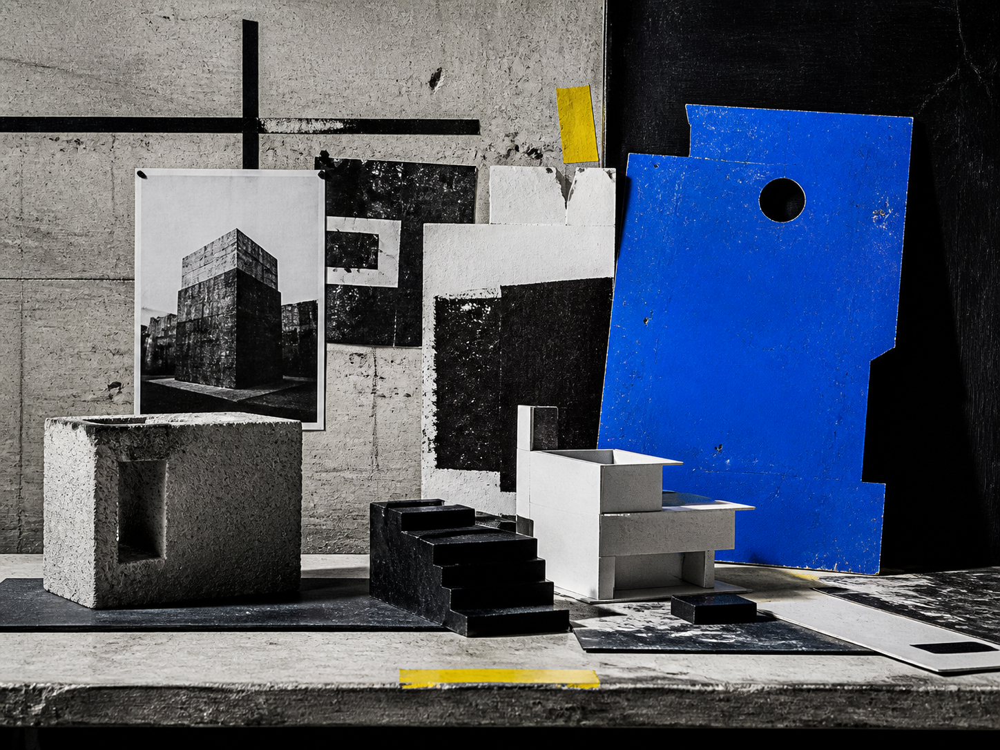
Raw, loud, and unapologetic. Hard borders, system type and clashing color — the web stripped back to its honest, concrete bones.
Raw structure
The undecorated skeleton of the page IS the design. Exposed layout, no gloss, no softening — honesty over polish.
Hard borders & shadows
Thick black outlines and solid, offset drop-shadows with zero blur. Everything is a blunt, physical block.
Clashing color
Loud, near-default brights slammed together without harmony. Discomfort is part of the appeal.
Big system type
Stark grotesque or default system fonts set huge and unrefined. Type shouts instead of whispering.
DAMAGE
IS THE
POINT.
Neo-brutalism is unique in making discomfort a feature. Where almost all web design chases frictionless polish, brutalism keeps the rough edges on purpose — clashing color, hard shadows, raw structure — to signal that a real human made this, not a corporate template. It trades comfort for personality and impossible-to-ignore presence.