Take the calm with you.
Each card below is a style seed. Paste one into any AI builder, bring your own business, and it comes back quiet.
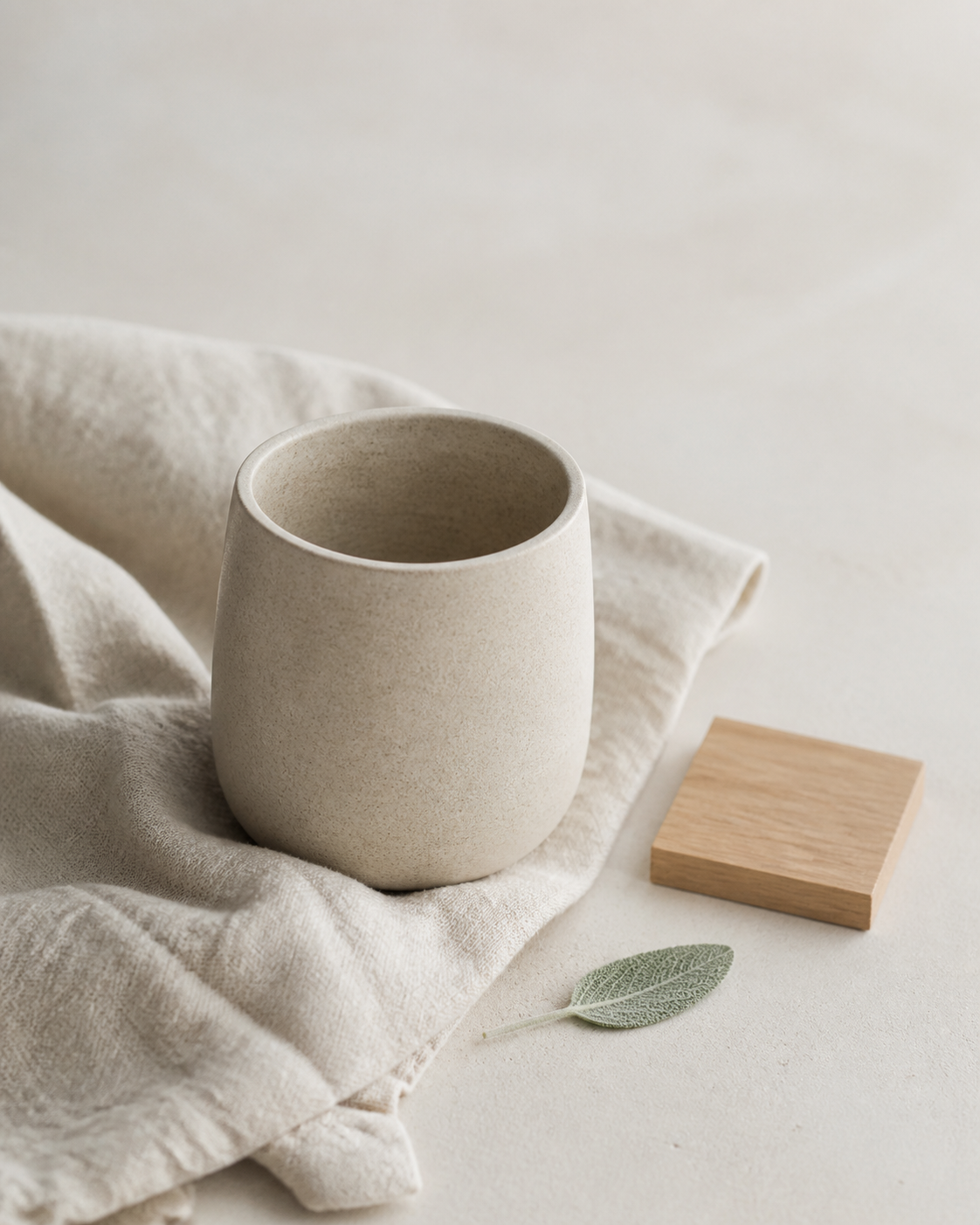
Build me a complete, responsive business website in the SCANDINAVIAN style — calm, lived-in daylight. Airy pale grounds, natural-material photography (wood, wool, ceramic, linen, bright interiors), small precise type with generous whitespace, and near-stillness. Warmth comes from materials and light, never from decoration. It should feel trustworthy the way a well-made chair feels trustworthy. Combine this style seed with my brief below. If I don't give you details, invent a plausible business this look suits — an interiors studio, a skincare brand, a boutique hotel, a specialty coffee roaster — and build the full, real demo for it, not a placeholder. This style is a FAMILY, not one template. Choose one of each and COMMIT to it across the whole site: • GROUND TEMPERATURE — pure white and cool, or warm off-white/greige. Commit to one ground family. • ACCENT — exactly one muted warm accent at a time, drawn from a material: oak tan, muted sage, soft clay, dusty blue — or my brand hue desaturated into that family. Examples, not requirements. • TYPE VOICE — all quiet sans, or quiet sans with warm serif captions. Small sizes, wide margins, letter-spaced uppercase labels for eyebrows/captions. • PHOTO MOOD — bright-airy morning light or warm dusk light. Commit; all photography shares one mood. • LAYOUT ARCHETYPE — caption-card grid (photos with small captions beneath), split photo bands (image one side, quiet text the other), a single-column story, or a storefront grid. Commit. INVARIANTS — break one and it stops being scandinavian: • Backgrounds are flat pale color only — white, off-white, greige. No gradients, no textures, no dark themes, no decorative patterns. • Photography is the warmth budget: natural materials, daylight interiors, product still-lifes on seamless pale grounds. Use real placeholder <img> elements for photos — never colored divs pretending to be images. • Captions sit BENEATH photos (small, letter-spaced); text goes over a photo only on its calmest pale zone, with a white scrim if needed for contrast. • Hierarchy is made with space, not size or weight — nothing shouts; sections separate by whitespace, not dividers or heavy rules. • Near-stillness: opacity-only dissolves and hover zooms of at most 1.05 scale; 0–1 animation per section; many sections simply still. No bounces, no staggered choreography, no parallax. Honor prefers-reduced-motion; content visible without JavaScript. • One accent at a time; buttons are ink-on-pale or thin ink outlines. • CONTRAST (WCAG 2.2 AA, non-negotiable): every text/background pair ≥4.5:1 for body, ≥3:1 for large text — muted grays only at larger sizes; over photos always use a scrim or the photo's palest zone. Never pale-gray-on-white body text. WHAT THIS SITE MUST ACHIEVE (business goal): make it instantly clear who this business helps and what it offers; build trust through calm credibility (real materials, real process, real people — whatever is true); and lead to one clear next step. Let my business and brief decide which sections serve that goal, include exactly those in a sensible order, and build each one fully. BUILD REQUIREMENTS — ship a complete, usable site, not a hero mock: • Real information architecture driven by MY goal, with working navigation (small, letter-spaced) and a quiet footer. • Every section carries real content depth (never a title plus one thin line), proper hierarchy-by-space, and photography where the section's story needs it — this style is image-heavy; most sections should carry a photo. • Real, tailored copy for MY business — plain, warm, honest sentences. Never lorem, never hype. • Fully responsive and accessible: semantic landmarks, alt text, visible focus states, and the AA contrast invariant enforced everywhere.
Best for AI website builders — Lovable, v0, Bolt
Restyle my existing website into the SCANDINAVIAN style — calm, lived-in daylight — WITHOUT changing my content, information architecture, or functionality. Keep my copy, pages, sections, images, and links exactly as they are; change only the visual system. Apply this system to what I already have: • Grounds: replace every background with flat pale color — white, warm off-white, or greige (pick one family and commit). Remove gradients, textures, dark sections, and decorative patterns. • Photography: keep my images but present them the scandinavian way — hairline-framed, generous gutters, captions moved BENEATH the image (small, letter-spaced); text over a photo only on its calmest pale zone with a white scrim. • Type: keep or swap to a quiet modern sans (optionally warm serif captions); reduce display sizes toward modest; add letter-spaced uppercase eyebrow labels; let whitespace do the hierarchy work that weight used to do. • Accent: collapse my palette to ink + pale grounds + exactly ONE muted material accent (oak/sage/clay/dusty-blue family, or my brand hue desaturated). Buttons become ink-on-pale or thin ink outlines. • Spacing: open everything up — bigger margins, wider gutters, more line-height; sections separated by air instead of dividers. • Motion: strip animation down to near-stillness — opacity-only dissolves where something must change, hover zooms of at most 1.05 on photos, 0–1 motion per section, nothing bouncing or staggering. Honor prefers-reduced-motion; never leave content invisible without JavaScript. • CONTRAST (WCAG 2.2 AA, non-negotiable): every text/ground pair ≥4.5:1 body, ≥3:1 large; muted grays only at larger sizes; scrims over photos wherever a pair would fail. Stillness is the point: if a section feels like a bright room at 10am — pale, warm, unhurried — it's right. Apply the system to EVERY page and section — navigation, footer, and forms included — not just the hero.
Paste alongside your existing site/code for an AI coding agent to apply
Build me ONE complete section of a website in the SCANDINAVIAN style — calm, lived-in daylight. I'll name the section and its job below (a hero, a product row, an about band, a contact block — anything); if I don't, build a hero for a plausible interiors or craft business and give it real copy. Rules for the section: • Ground: one flat pale field — white, warm off-white, or greige. No gradients, textures, or dark grounds. • Photography carries the warmth: one real placeholder <img> (a daylight interior, a material close-up, or a still-life on a seamless pale ground) in a hairline frame — never a colored div pretending to be a photo. Caption beneath it, small and letter-spaced. • Type: quiet modern sans at modest sizes; a letter-spaced uppercase eyebrow; hierarchy made with whitespace, not weight. • One muted material accent only (oak/sage/clay/dusty-blue family); actions are ink-on-pale buttons or thin ink outlines. • Motion: at most ONE gentle opacity dissolve or a ≤1.05 hover zoom — stillness is on-style. Honor prefers-reduced-motion; content visible without JavaScript. • CONTRAST (WCAG 2.2 AA): every text/ground pair ≥4.5:1 body, ≥3:1 large; if text sits on the photo, use its palest zone plus a white scrim. • Fill the section with real, purposeful content for its job — plain, warm, honest copy. Never lorem, never a bare box. Deliver it as clean standalone HTML/CSS (or the framework I'm using if I say so), responsive from mobile up.
Good for a focused first pass, or a chat assistant like ChatGPT/Claude
Paste any prompt as-is — it builds a complete site with no edits. To make it yours, fill the “Your site” block with your business, pages, and goal; leave it blank and the prompt invents a fitting demo instead.
SCANDINAVIAN — distilled style DNA for coding agents.

SOUL: calm, lived-in daylight. Airy pale space where natural-material photography breathes; function visible, nothing shouts. Color, ornament, and motion recede to near-stillness; warmth comes entirely from materials and light.

GROUNDS: flat pale only — #FFFFFF, warm off-white #F7F5F1, greige #EDE8E0. No gradients, textures, dark themes, or patterns. Sections separated by whitespace, not dividers; hairline rules (#E5E0D8) at most.

INK & ACCENT: warm near-black ink #1F1D1A; muted #6E675D (large sizes only). Exactly ONE muted material accent at a time — oak #C9A57B, sage #9AA88F, clay #B4826B, dusty blue #8FA3B0, or a brand hue desaturated into that family. Buttons: ink-on-pale or 1px ink outline; underline links.

TYPE: quiet modern sans (Epilogue-class) at modest sizes; letter-spaced uppercase labels (11px, 0.2em) for eyebrows and captions; optional warm serif for captions. Hierarchy is made with SPACE — generous margins, wide gutters, 1.6–1.8 line-height — never with shouting sizes.

MEDIA (image-heavy): photography is the warmth budget — daylight interiors, material close-ups (wood/wool/ceramic/linen), still-lifes on seamless pale grounds. Real <img> placeholders, hairline frames, captions BENEATH (small, letter-spaced). Text over a photo only on its calmest pale zone with a white scrim. Most sections carry a photo.

MOTION (verb: dissolve): near-stillness — opacity-only crossfades 400–900ms even ease-out; hover zoom ≤1.05 over 600ms; 0–1 animation per section, many sections still; no translate choreography, no bounce, no stagger. Honor prefers-reduced-motion.

LAYOUT: calm photo grid with captions beneath (storefront archetype), split photo bands, or single-column story; strict grid, generous gutters; nothing overlaps except caption-on-calm-photo.

CONTRAST (hard rule): WCAG 2.2 AA — ≥4.5:1 body, ≥3:1 large — on the actual pale ground; muted gray only at larger sizes; scrim over photos.

NEVER: gradients or textures as decor; more than one accent; loud display type; animation choreography; text over a photo's busy area; captions on top of images.
Drop this into a project's instructions/skill file for a reusable reference, instead of a one-shot prompt.
See it worn two more ways.